20% off Birthday Letters to my Baby, Cute and Funny Things you Say and a Pen

Our nursery tour

This is the third time I’ve designed a nursery, so this time I definitely benefitted from the experience of the last two. We’d just finished renovating our house when we designed the nursery, so it was a very blank slate. In a way this was ideal but it meant we needed to bring in lots of elements to make sure it didn’t feel bland.

It’s definitely not finished; there are further features I’m planning to add at some point and, of course, it will evolve over the years, but I thought it would be fun to give you a glimpse into what we created.

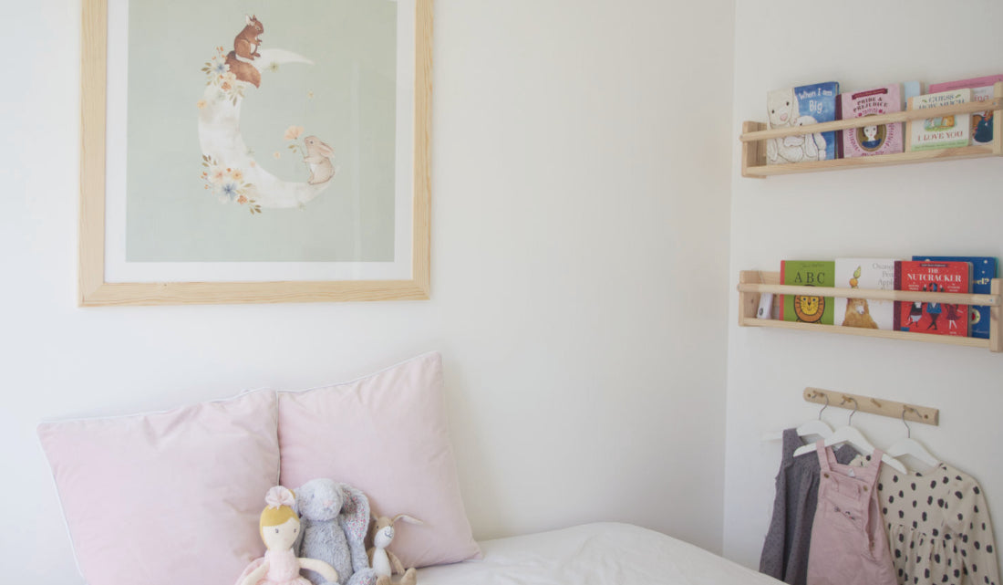
The overall effect I wanted was soft and relaxing with a slightly feminine feel. For the colour palette I focused on mint green and white with pops of pink, bringing in textures like the sheepskin to give the otherwise simple design some extra depth.

A big feature of the room is the art that we’ve hung to make this small space full of creative moments.

I’ve shared the sources of the main features below but if there is anything you want to know, let me know.
Cot
Dresser
Rug
Daybed
Mobile
Mirror
Watercolour print
Shelving
Nightlight
Art print
